The same cap rate, two different streets: grading neighborhoods right
Why two identical cap rates can hide two very different five-year outcomes
Investment
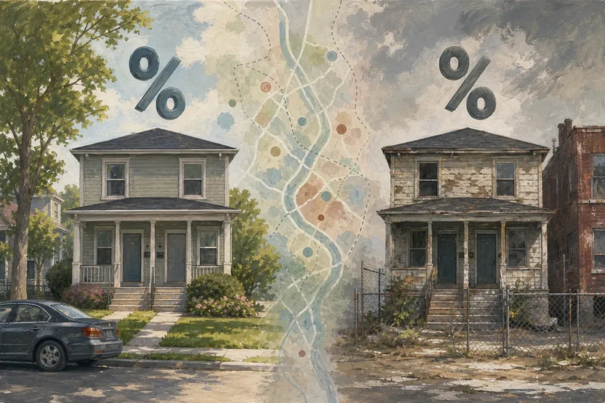
You find two duplexes, both listed at $180,000, both renting at $1,800 a month combined. Same 1% rule, same cap rate on the spreadsheet. One of them turns into a cash-flowing machine. The other eats your evenings with turnover, Section 8 inspections that fail twice, and a tenant base that can't absorb a rent increase without moving out.
The spreadsheet didn't lie. It just didn't know the neighborhood. Most investors still grade a deal by the four walls and the rent roll, and skip the three-block radius that actually determines whether that rent roll holds up for five years.
Why the address matters more than the asking price
A property's performance is downstream of who lives around it, what they earn, and how stable that income is. You can't see that from a listing photo or even a drive-by.
Take two neighborhoods in the same metro, both with median rents around $1,100. One has a poverty rate of 12% and median household income growing 3% a year. The other has a poverty rate of 34% and income flat for a decade. Same rent today, very different rent five years from now.
- A neighborhood with rising income can absorb rent increases without losing tenants.
- A neighborhood with stagnant or declining income forces you to choose between vacancy and under-market rent.
- A neighborhood with high turnover in the surrounding blocks tells you to budget more for make-ready costs, even if your specific unit looks fine today.
What the American Community Survey actually tells you
The ACS, run annually by the Census Bureau, is the deepest free dataset on who lives in a census tract. Most investors have never opened it, which is exactly why it's valuable.
Pull median household income, percent renter-occupied, and year-over-year population change for a tract before you buy. A tract losing population 2% a year while a neighboring tract gains 1.5% isn't a rounding error, it's a signal about where demand is heading over your hold period.
I look at renter-occupied percentage specifically because it tells you about tenant pool depth. A tract that's 70% renter-occupied has a deep, liquid tenant market. A tract at 25% renter-occupied means you're competing in a thin market where a bad month of vacancy really hurts.
The Social Vulnerability Index flags risk the rent roll won't show you
The CDC's Social Vulnerability Index scores every census tract on things like unemployment, housing cost burden, single-parent households, and access to transportation. It was built for disaster response planning, but it doubles as a shockingly good proxy for tenant stability.
A tract scoring in the top quartile nationally for vulnerability tends to run higher eviction rates and higher maintenance turnover, even when the rent comps look identical to a lower-SVI tract three miles away. I've seen two properties four blocks apart in Memphis with nearly identical rent, but one sits in an SVI decile of 3 and the other sits at 9. The 9 isn't a dealbreaker, but it changes your reserve math. Budget an extra month of vacancy a year and a steeper maintenance line, and the deal still works. Skip that adjustment and you'll find out the hard way at month 14.
Housing Choice Voucher data tells you who your actual tenant pool is
HUD publishes Housing Choice Voucher (Section 8) utilization by tract. This matters for two reasons most investors miss.
First, a tract with heavy voucher concentration usually means rent is backed by a government payment that shows up reliably, which can be a stabilizing force, not a red flag, as long as you underwrite the inspection standards and turnaround time correctly. Second, a tract with very low voucher presence next to rents that look suspiciously low compared to the metro average often means something else is wrong, maybe crime, maybe school quality, that hasn't shown up in the other datasets yet.
Data source | What it measures | What it tells an investor |
|---|---|---|
ACS | Income, renter share, population trend | Tenant pool depth and rent growth potential |
SVI | Vulnerability across housing, economic, demographic factors | Turnover and reserve budgeting |
HCV | Voucher concentration by tract | Payment reliability and tenant mix |
None of these numbers mean anything in isolation
A high-income tract with a low renter share might mean there's barely any rental inventory to compete with, which is good, or it might mean you're buying into a neighborhood that's shifting toward owner-occupants who'll eventually push rental comps down as the area gentrifies past your tenant base. The same raw number cuts two different ways depending on the trend line around it.
This is the part that eats hours. Pulling ACS tables, cross-referencing SVI deciles, checking HUD voucher maps, then trying to mentally merge three government datasets with three different geographies and update schedules, that's an afternoon per deal if you're being thorough, and most investors just don't do it. They buy on rent comps and hope.
How Cylier turns this into one map instead of three afternoons
We built a neighborhood grading map inside Cylier that pulls ACS, SVI, HCV, and a handful of other sources into a single score for every tract you're looking at, refreshed as new census data drops. Instead of toggling between government portals and guessing how a 34% poverty rate stacks against a rising income trend, you get a graded view of investability layered right into the same report where you're already running your cash flow numbers.
If you're comparing three listings in three different tracts this week, pull up the Cylier grading map before you pull up the rent comps. It'll tell you in thirty seconds what used to take an afternoon of government spreadsheet archaeology, and it'll flag the deal that looks fine on paper but sits in a tract trending the wrong way for the next five years.